In a world saturated with loud imagery and visual chaos, the ultimate luxury is visual silence. When planning a themed event, the temptation to fill every square inch with decor to “emphasize the theme” is immense. However, true sophistication works in the opposite direction: it lies in the ability to strip away the non-essential, leaving only those elements that carry profound meaning.
This guide explores the philosophy of “visual hygiene” and how to create a refined atmosphere through restraint, color discipline, and intellectual accents.
1. The “Visual Lane” Concept
Professional designers don’t just decorate—they build systems. The true integrity of an event is not about what you add, but what you choose to exclude. Instead of simply copying a theme from Pinterest, identify its DNA. This is a single visual thread that runs through the event like an invisible dotted line.
It could be a specific font slant, a particular paper texture, or a single recurring graphic symbol. When a guest sees this element on the invitation and later on a small card by their dessert, they experience a subconscious sense of harmony and order. This “single visual lane” keeps the event within a unified conceptual framework.
2. Color Discipline and Chromatic Asceticism
Color is the most potent emotional trigger. When an event is cluttered with random hues, the guest’s brain experiences fatigue. Sophistication demands a strict dictatorship of color.
To make an event feel monolithic, use the 60/30/10 formula:
- 60% — Dominant neutral background (walls, linens).
- 30% — Secondary color for depth (furniture, large signage).
- 10% — Sharp accent (font color on cards, a single floral variety, or metallic finishes).
By sticking to this proportion, you create a space that feels expensive regardless of the budget. If a bottle at the bar doesn’t fit the palette—relabel it with a minimalist sticker or hide it. Restraint in the palette allows the eye to rest, highlighting the most important element: your guests.
3. Smart Stationery as Experience Architecture
In a minimalist approach, paper ceases to be just a carrier of information—it becomes an art object. A single high-quality printed element on a table is worth more than ten generic banners.
- Tactility: Choose high-GSM paper, cotton textures, or translucent vellum. The physical sensation of touching a menu forms the first impression of the event’s status.
- Typography: A font is the voice of the evening. Use 1–2 stylish typefaces and plenty of “white space.” A beautifully typeset menu on a plain white background looks far more modern than illustrated posters.
- Micro-accents: Instead of large-scale decorations, focus on the details. Minimalist glass tags, personalized place cards, or small tags on guest favors tie all zones together into one cohesive story.
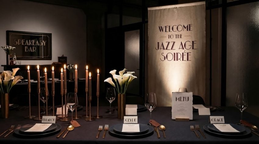
4. Signage and Banners: From Navigation to Art
Banners at events often look like advertisements. To avoid this, treat your signage as installations rather than announcements.
Replace quantity with scale. One large fabric banner—made of linen or heavy canvas—with a single, poignant quote looks ten times more refined than a dozen small posters. Utilize non-traditional materials like glass, acrylic, or mirrors. Such signage doesn’t just inform; it becomes part of the space’s architecture, guiding the guest’s gaze from the welcome area to the bar.
5. Table Architecture and the Lighting Scenario
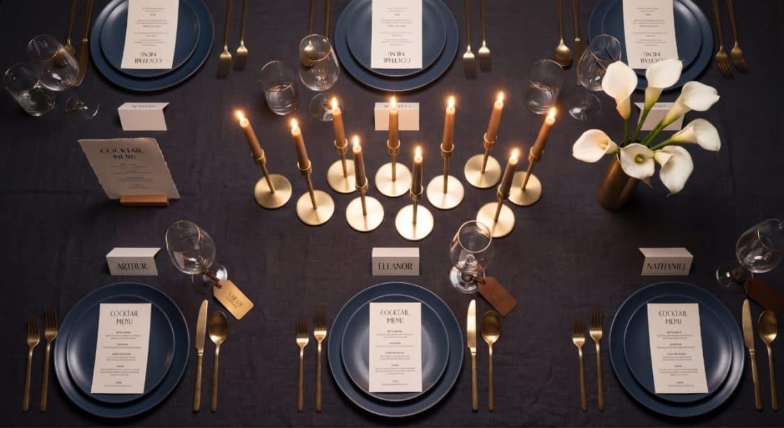
The table is the center of gravity where restraint is more important than anywhere else. Use geometric rhythm: a row of identical candles or identical menus creates a visual order that calms the eye. Leave “air” between objects; emptiness emphasizes the status of the objects you’ve chosen to keep.
The final touch is lighting. No amount of decor can save an event if the lighting is wrong. For a sophisticated atmosphere, turn off all overhead lights. Use only “bottom lighting”: candles, table lamps, and spotlights for signage. This creates the necessary depth and shadows, hiding venue flaws and highlighting your intentional accents.
The Transformation: From Chaos to Concept
To understand the difference between average styling and refined design, consider how key elements are transformed:
- In Decor: Instead of “a little bit of everything” (balloons, mixed flowers, tinsel), choose 2–3 large-scale accent objects. One powerful installation works better than scattered visual noise.
- In Color: Give up the “rainbow” in favor of a strict palette. A dictatorship of color instantly makes a space feel unified.
- In Stationery: Replace standard web templates with bespoke typography on tactile paper. Print quality is an invisible marker of status.
- In Lighting: Forget bright lamps. Only ambient, multi-layered, and warm light can create true magic.
- In Materials: Swap plastic and vinyl for noble textures: linen, glass, metal, or heavy matte paper.
Summary: A sophisticated event doesn’t scream about its budget—it whispers about its intentionality. It is an intellectual game where elegance is read between the lines, and integrity is born where excess ends. Be bold in your restraint.
Tim Absalikov is a veteran digital marketer with a degree in computer science and economics. As the acting director of Lasting Trend, his vast knowledge in technology and digital marketing allows him to offer services such as SEO, SEM, UX/ UI, dynamic retargeting, and social media integration. Tim is a top-notch E-Commerce specialist and develops highly intuitive SEM and SEO best practices.